Dior Logo Evolution: Luxury Branding Through Time
Few fashion houses have defined elegance and luxury quite like Dior. Since its founding in 1946, Dior has become synonymous with timeless sophistication, high fashion, and impeccable branding. Central to its legacy is a seemingly simple yet iconic symbol: the Dior logo.
In this blog, we explore how the Dior logo has evolved, why it resonates so powerfully with luxury consumers, and what it teaches us about branding, especially if you're building your own brand like we are at Vésaura
A Brief History of Dior
Christian Dior opened his couture house in post-war Paris, launching his revolutionary “New Look” in 1947. This collection redefined femininity with cinched waists and full skirts, ushering in a new era of glamour.
But while the clothes changed seasonally, the logo remained remarkably consistent. That’s no accident.
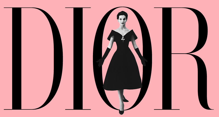
The Dior Logo: Simplicity as a Statement
The Dior logo is a typographic wordmark: the brand’s name rendered in a refined serif font, usually in black. What makes it so powerful?
- Timeless Typeface: The serif font exudes class, balance, and heritage.
- All-Caps for Authority: Sometimes rendered in uppercase, it feels bold and sure of itself.
- Monochrome Elegance: The black-on-white (or white-on-black) palette reinforces minimalism and focus.
Branding Tip: The best luxury logos are often the most minimal. They signal confidence without shouting.
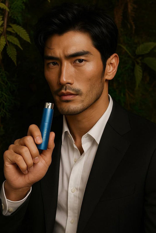
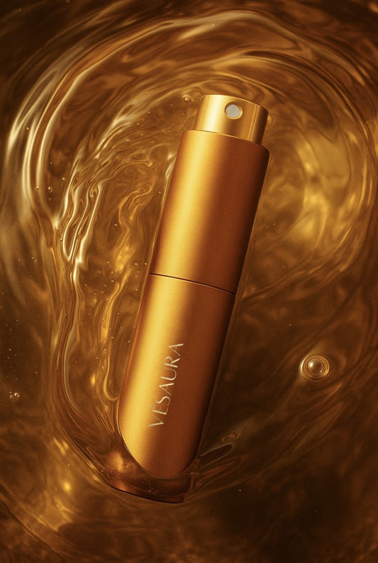
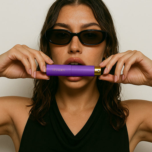
At Vésaura, we apply this philosophy in our own aesthetic, letting the quality of design and storytelling speak for itself.
![]()
Logo Evolution: What’s Changed?
Over time, Dior has made minor refinements rather than dramatic overhauls. This consistency reinforces the brand’s trust and timelessness, a core value in the luxury world.
Key moments:
- Early Logos (1940s–1960s): More elaborate and flourished typography.
- Modernization (1990s–2000s): Sleeker, sharper lines as minimalism took hold.
- Current Use: The clean “DIOR” in black serif, often paired with the brand’s star or CD monogram.

Why Dior’s Branding Works
The Dior logo succeeds because it:
- Speaks to its heritage without being outdated.
- Feels luxurious, yet understated.
- Evolves slowly, keeping trust intact.
This mirrors what we strive for at Vésaura, a brand that honours classic sensibilities while evolving with the modern creative world.
Logo, Identity, and the Psychology of Luxury
What emotions does the Dior logo evoke?
- Trust: Rooted in decades of excellence.
- Desire: It’s aspirational but not unattainable.
- Identity: Customers feel more “themselves” with Dior, not just dressed by it.
These are critical lessons for any brand builder. A logo isn’t just a graphic, it’s a psychological handshake.
From Dior to Vesaura: Lessons for Emerging Brands
At Vésaura, we draw inspiration from legacy houses like Dior, but we're building our own path, where symbolism, story, and subtlety converge.
Whether you're a designer, entrepreneur, or brand enthusiast, studying logos like Dior's can help you:
- Craft a more intentional brand identity.
- Understand what minimalism truly means.
- Build emotional resonance through design choices.
And if you're curious how we do that at Vésaura, take a peek at our creative Community where we share stories, inspirations, and behind-the-scenes designs and also where our frangrace loving members share their experience, inspirations and stories.
![]()
And remember the Dior logo isn’t just a name, it’s a masterclass in enduring luxury branding. Through steady evolution and disciplined restraint, Dior proves that you don’t need to shout to be heard in the fashion world.
For those of us building modern creative brands like Vesaura,there’s no better teacher!